
We are surrounded numerous Grid pattern like tile, precast pavers
and skyscraper's window. Grid is easily detectable pattern around us.
That was my core motivation to start this project.
How fun and easy would typography be
if we have a typeface that perfectly fits in any gird around us?
and skyscraper's window. Grid is easily detectable pattern around us.
That was my core motivation to start this project.
How fun and easy would typography be
if we have a typeface that perfectly fits in any gird around us?

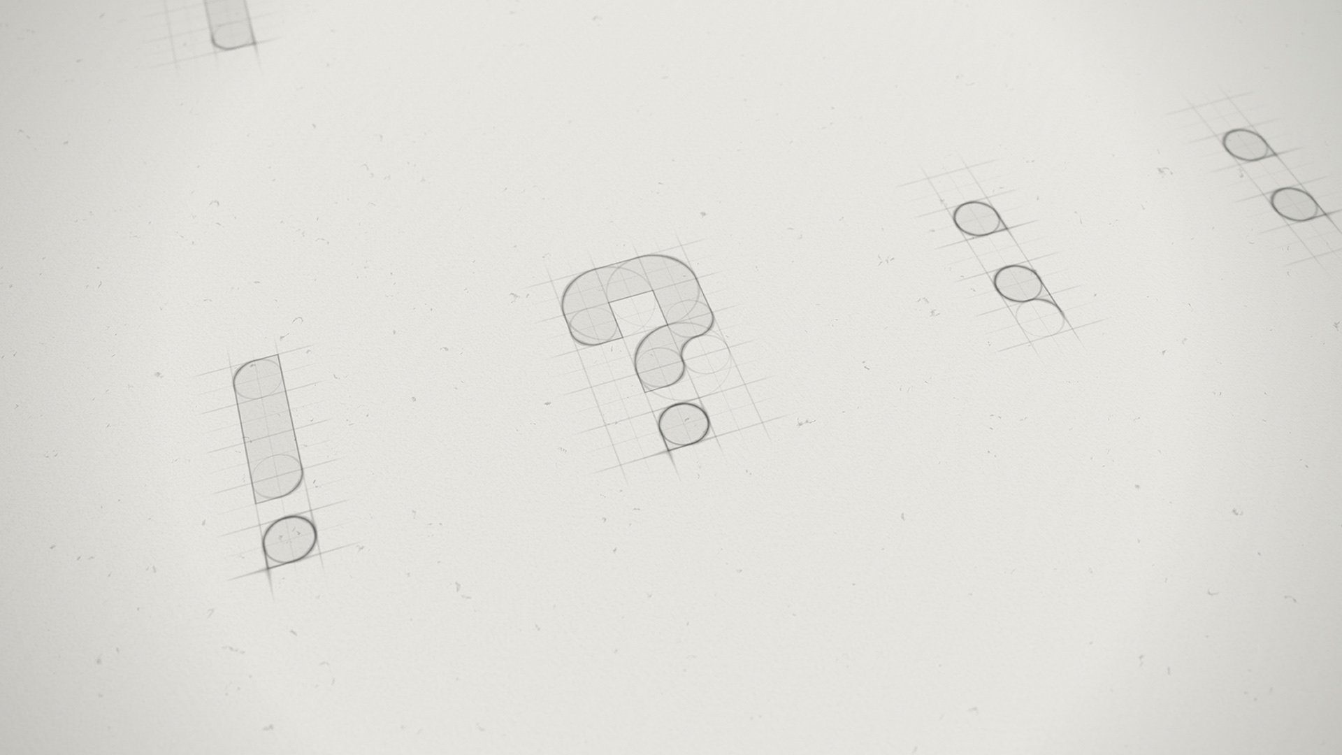
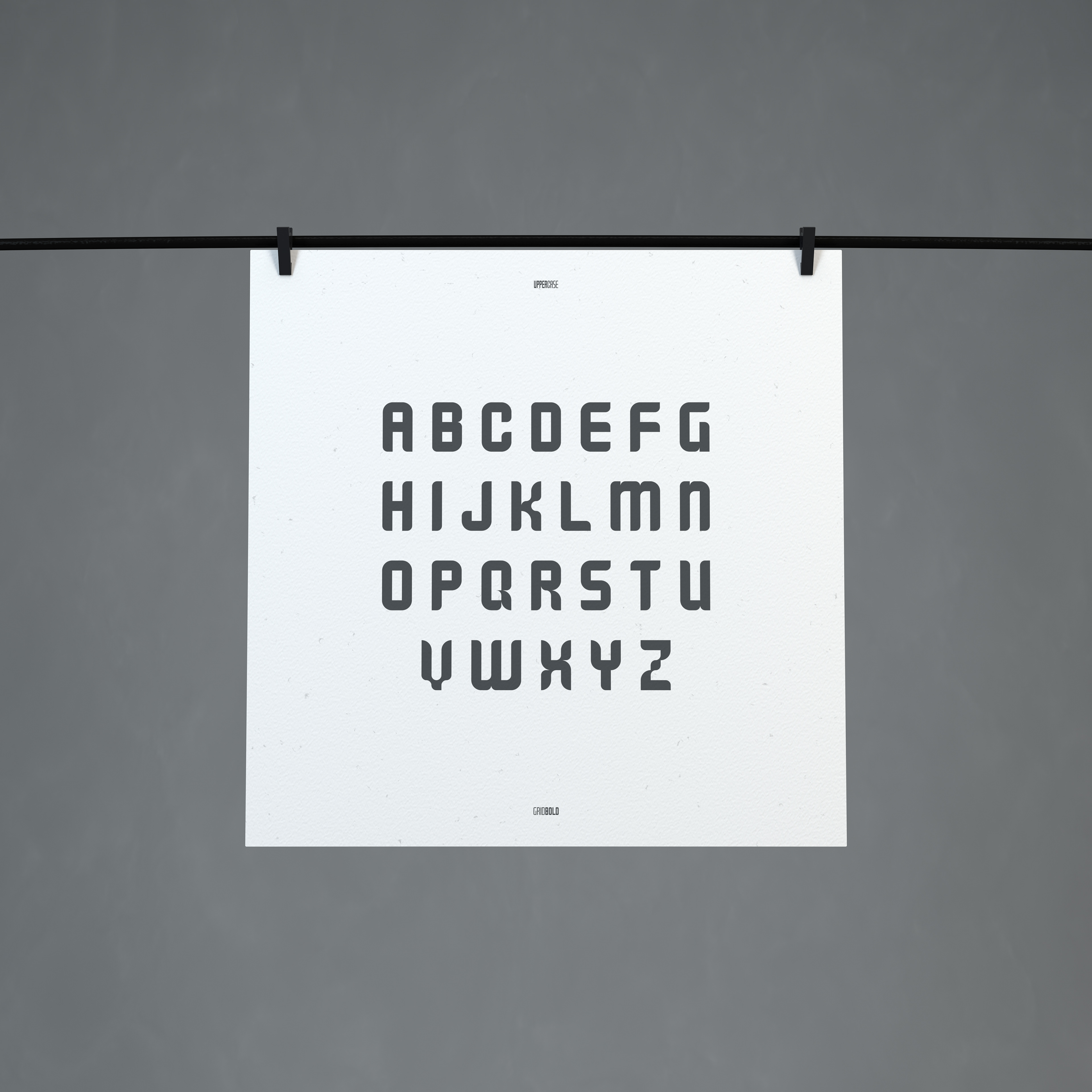
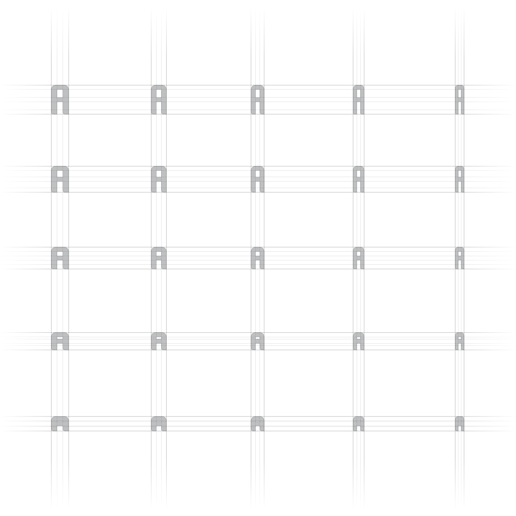
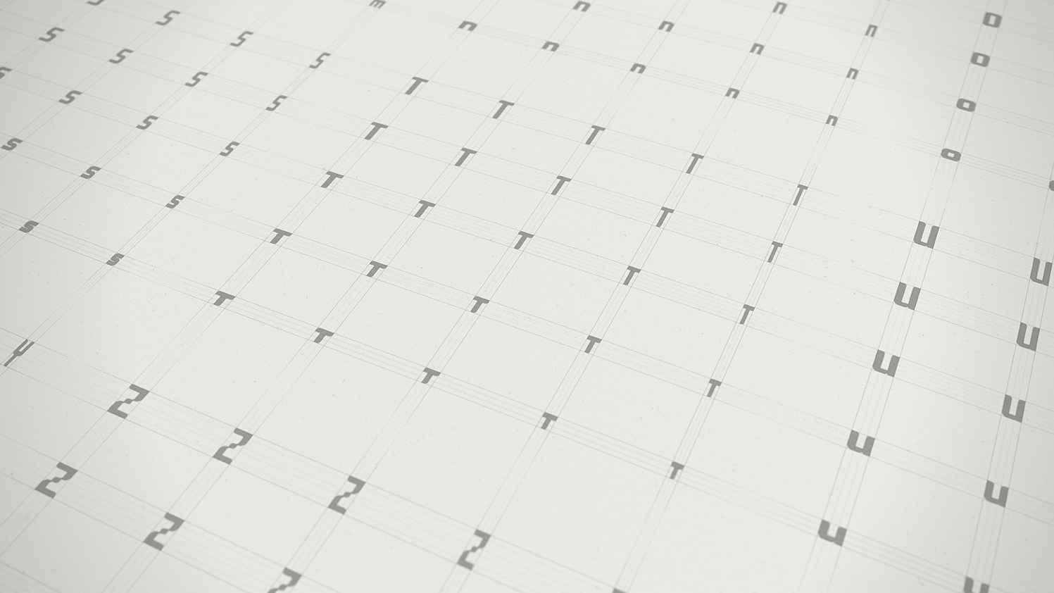
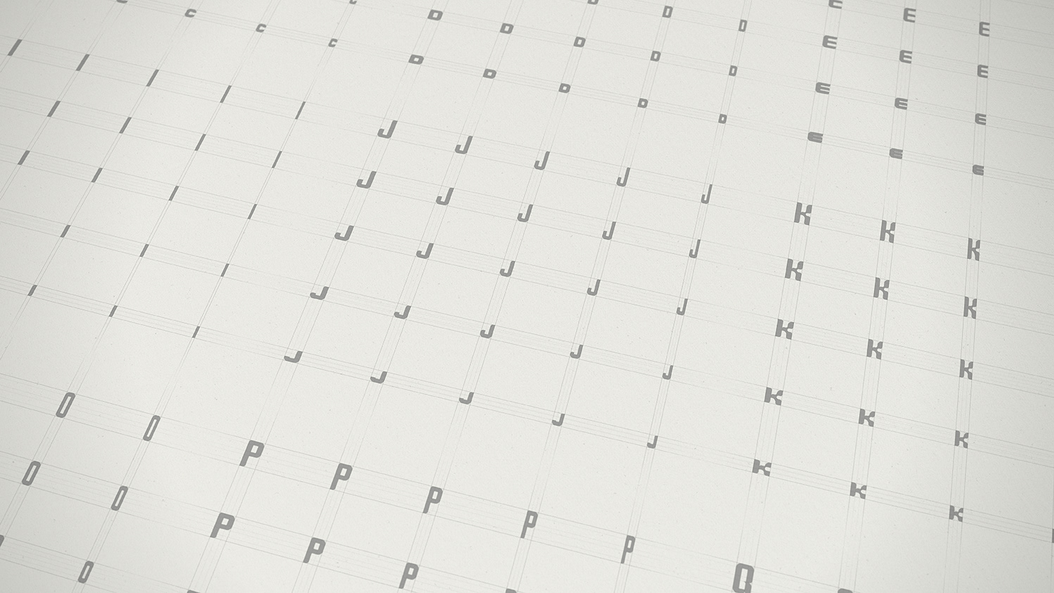
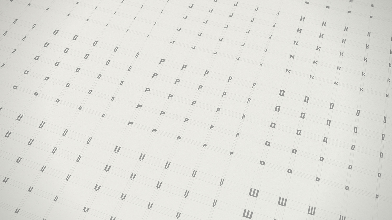
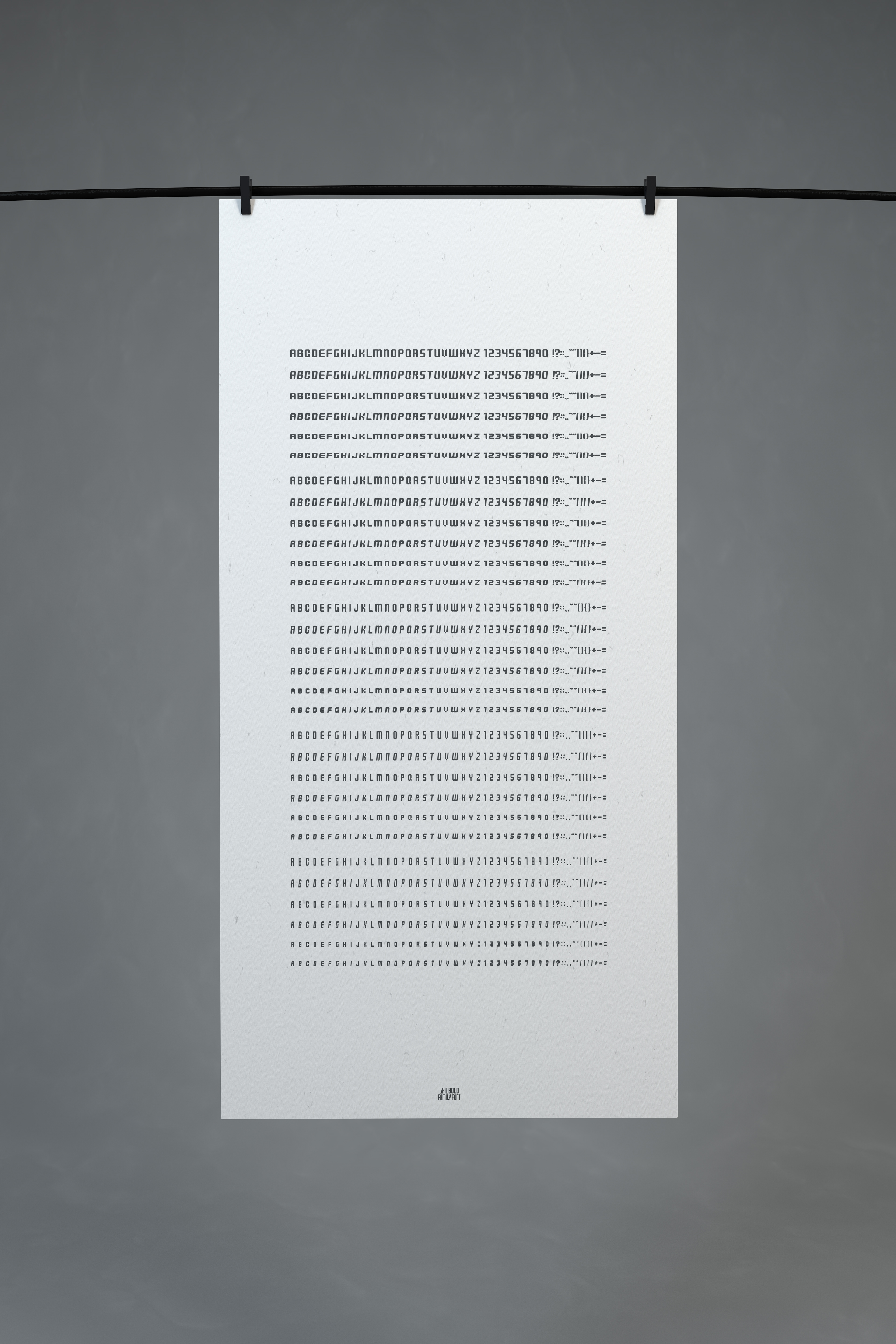
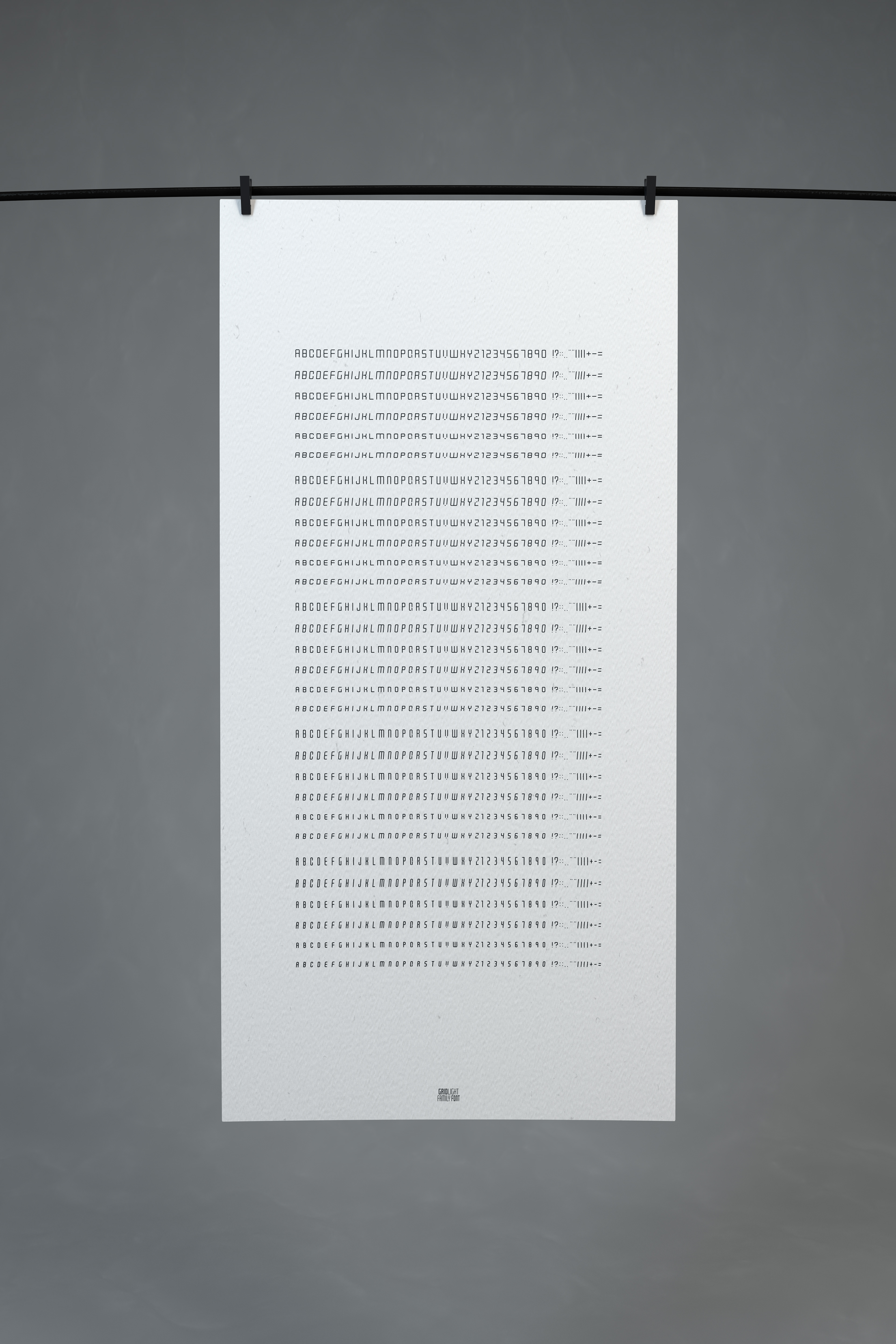
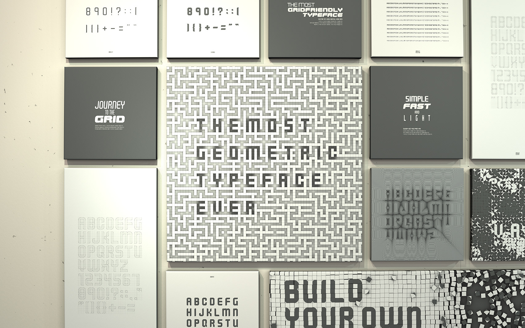
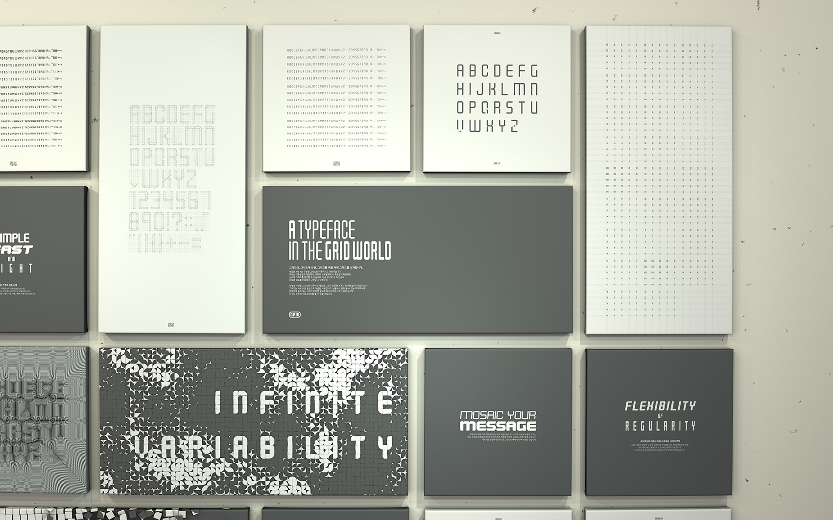
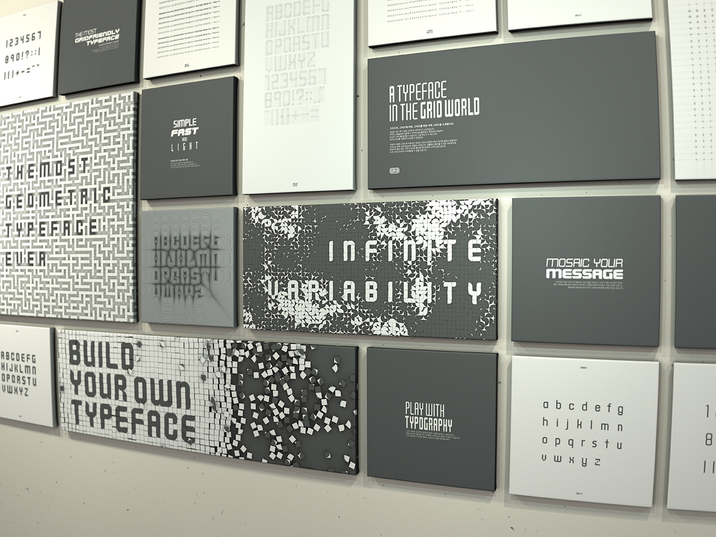
GRID has been built based on 3X5 square grid cells.
Since it is made of horizon, vertical and circle lines only,
the typeface perfectly fits on any grid.
Since it is made of horizon, vertical and circle lines only,
the typeface perfectly fits on any grid.

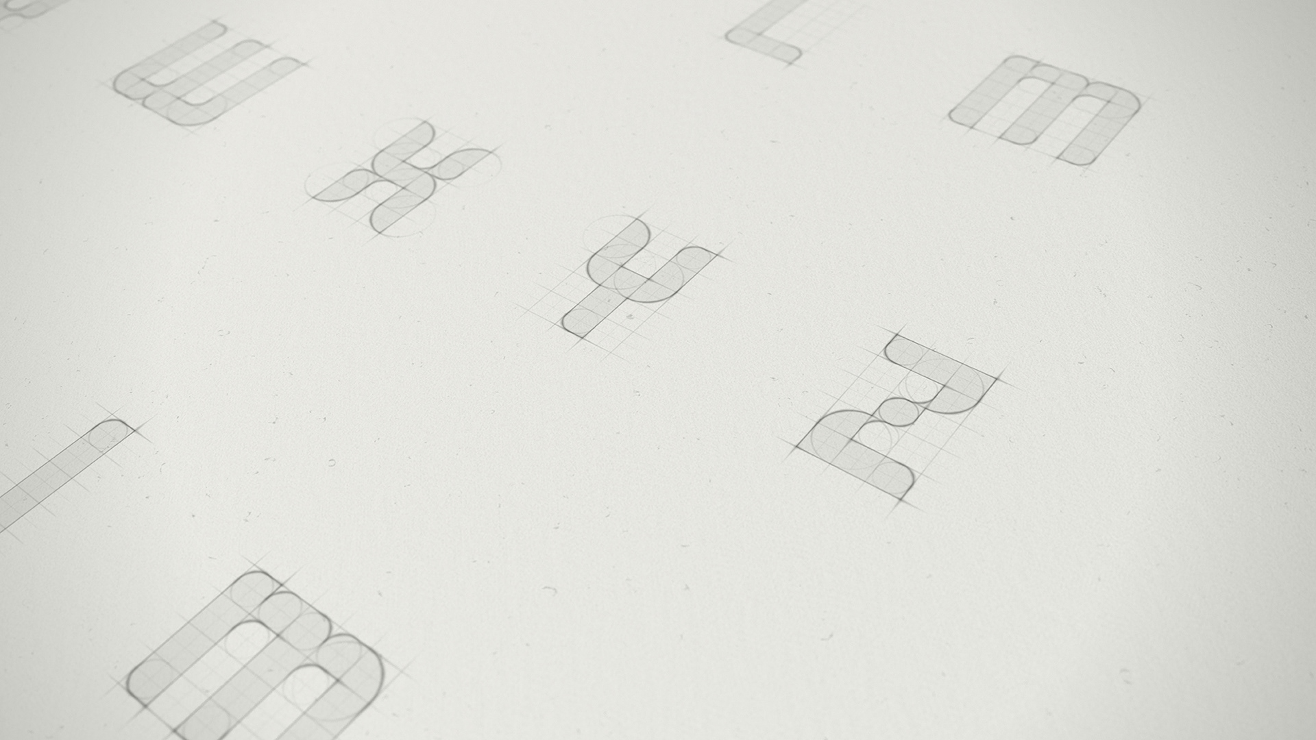

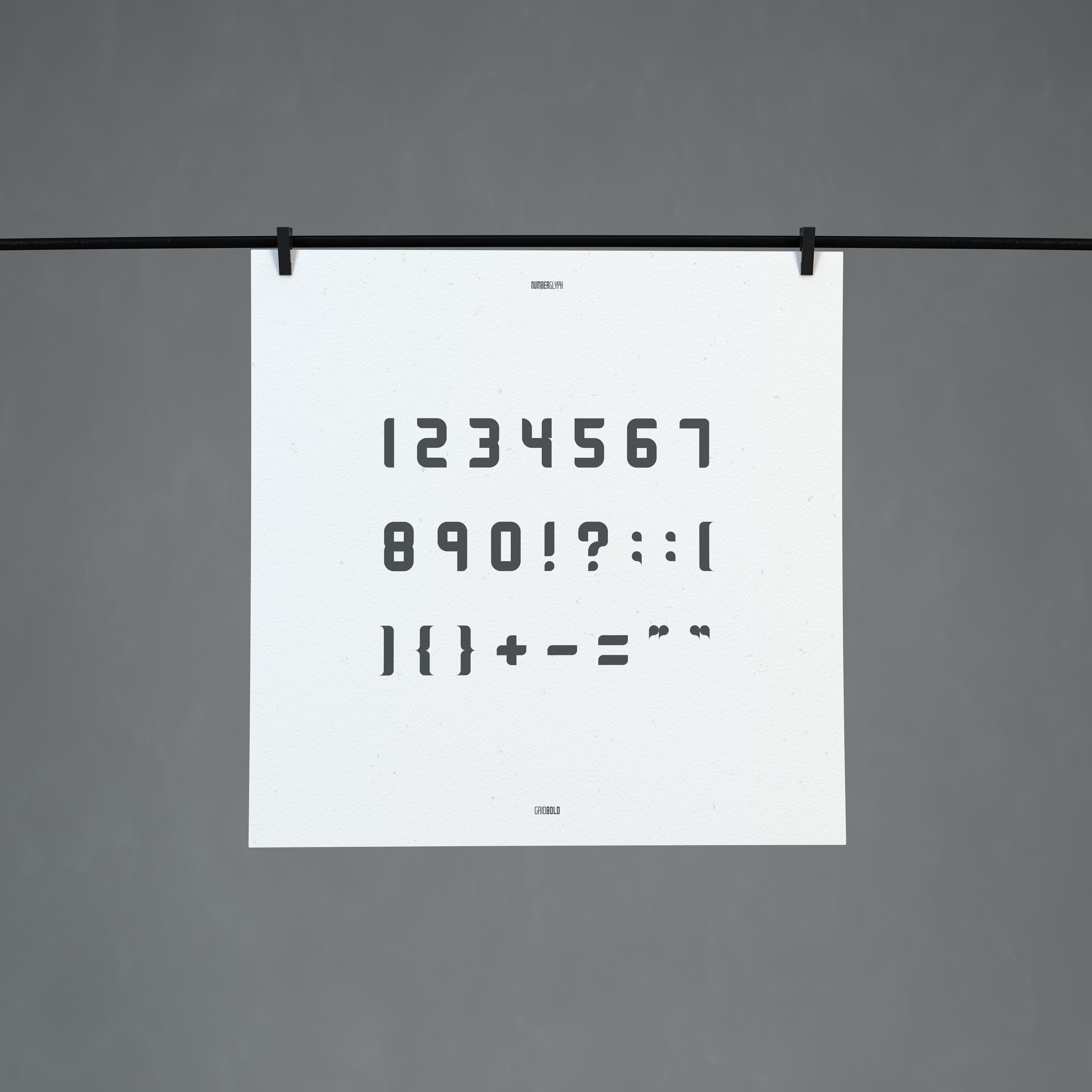

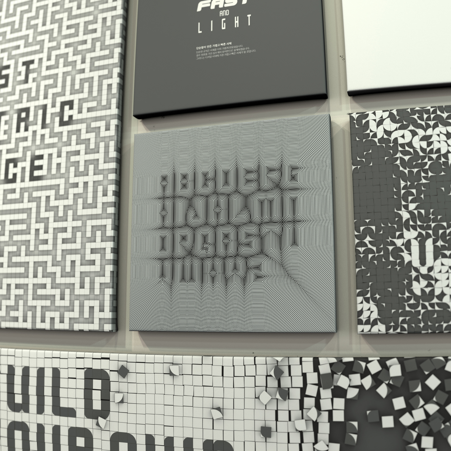
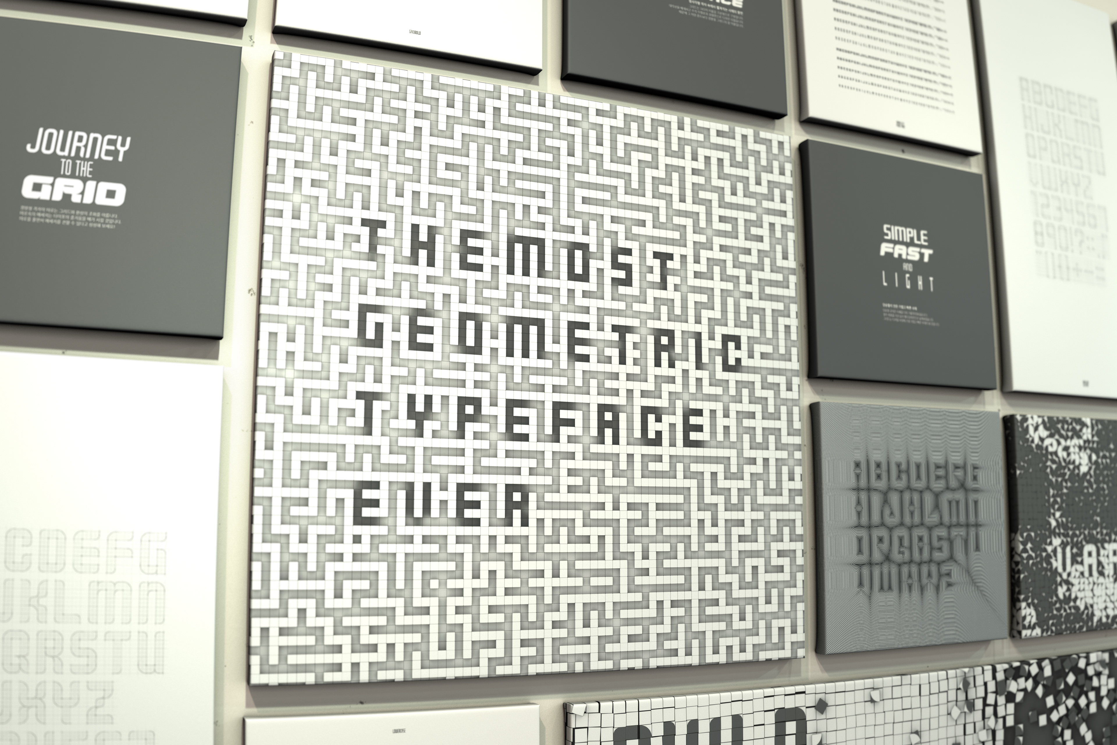
GRID is a flexible typeface to increase or decrease
the ratio of the font horizontally or vertically due to absence of diagonal.
the ratio of the font horizontally or vertically due to absence of diagonal.
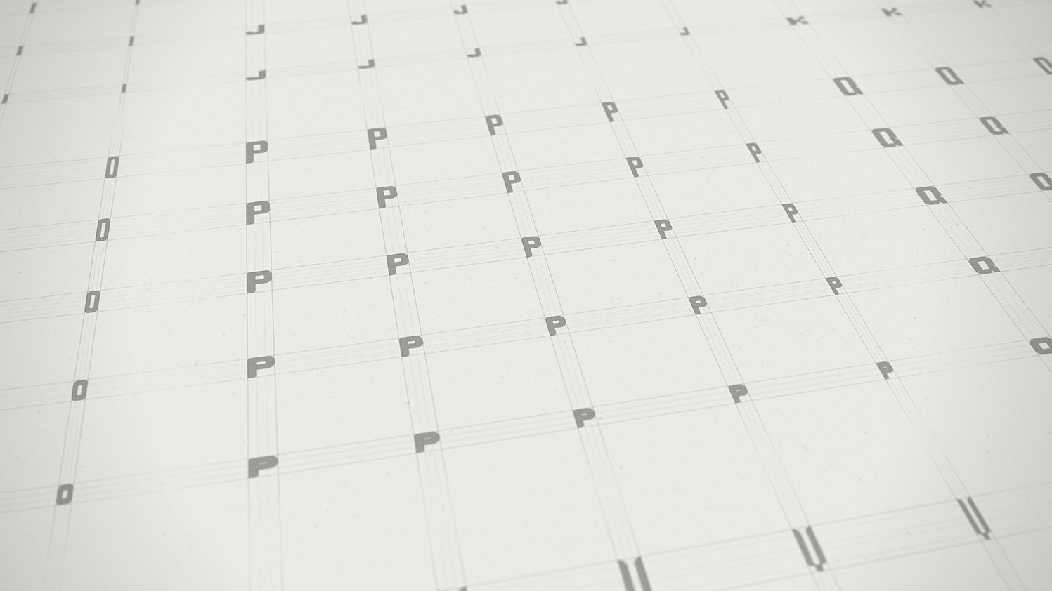
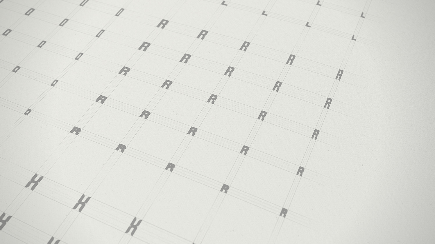
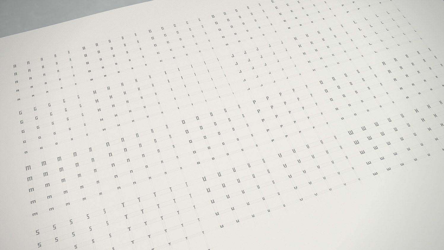
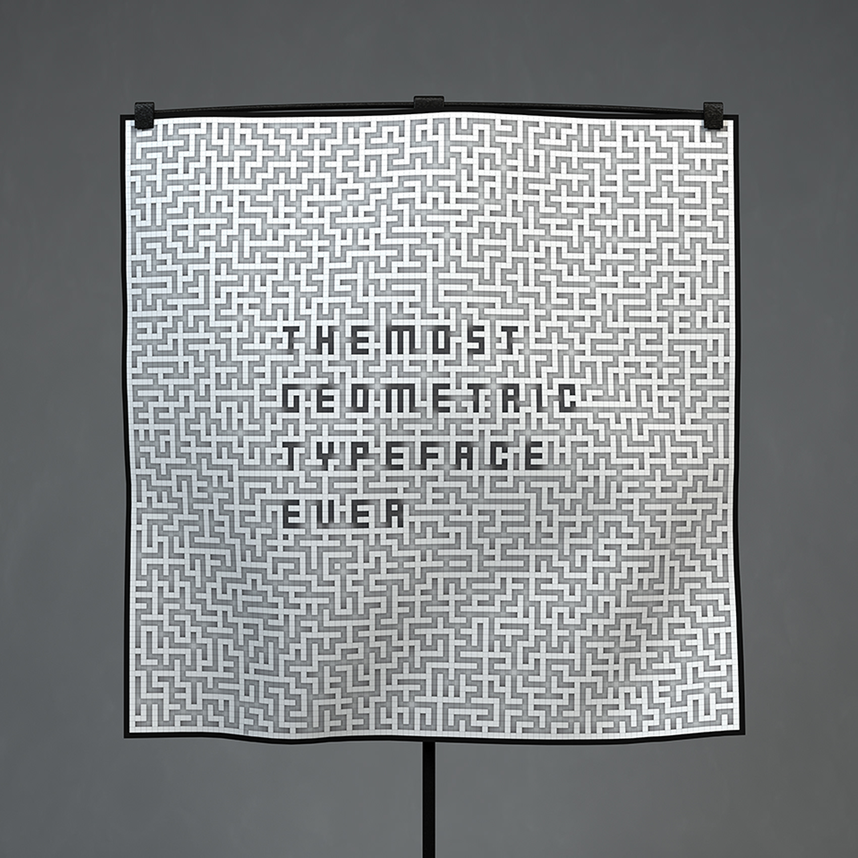
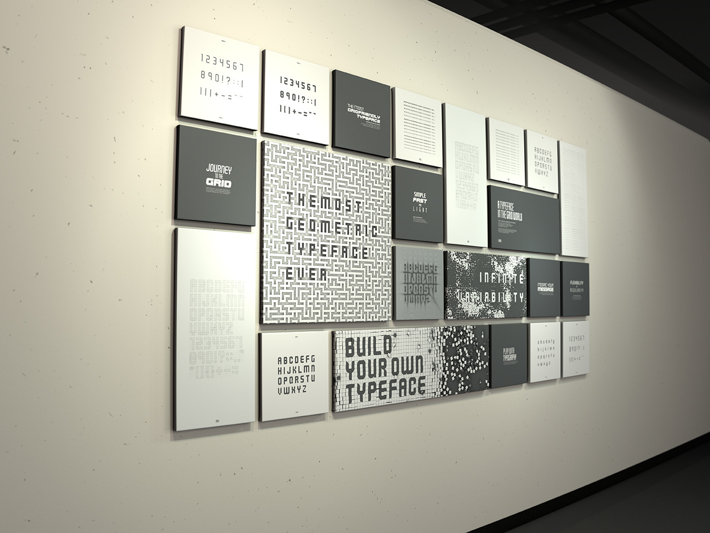
The pannels were displayed along the grid line.
It was intended to show the principles and practical uses of the font.
It was intended to show the principles and practical uses of the font.


Watch one of subprojects for grid through the link below